Oodaj. The Beauty of Minerals

Between digital and mineral, Oodaj creates a natural link between craftsmanship, science and technology.

The brand reinvents the online experience of semi precious stones through a clear, human and aesthetic approach where the material takes center stage.

Project overview

Challenge

Bring a digital brand to life in a universe often associated with mysticism and confusion.

Give Oodaj a scientific yet sensorial posture that highlights material, transparency and simplicity while keeping the experience accessible and intuitive.

Solution

Design a visual territory rooted in reality: mineral colors, balanced typography, natural light.

An identity that expresses both scientific precision and the poetic nature of minerals.

Results

A structured, coherent and desirable brand ready to deploy across all touchpoints.

A clearer, more educational and more engaging e commerce experience designed for both curious users and knowledgeable collectors.

The emotion of minerals, the clarity of digital

Every Oodaj stone tells a story shaped by time, transformation and matter.
We captured this sensitivity within a visual universe that feels calm, bright and grounded, where digital disappears to let the material speak.
An experience designed to convey knowledge as much as emotion.

Before:

A renewed visual and creative strategy

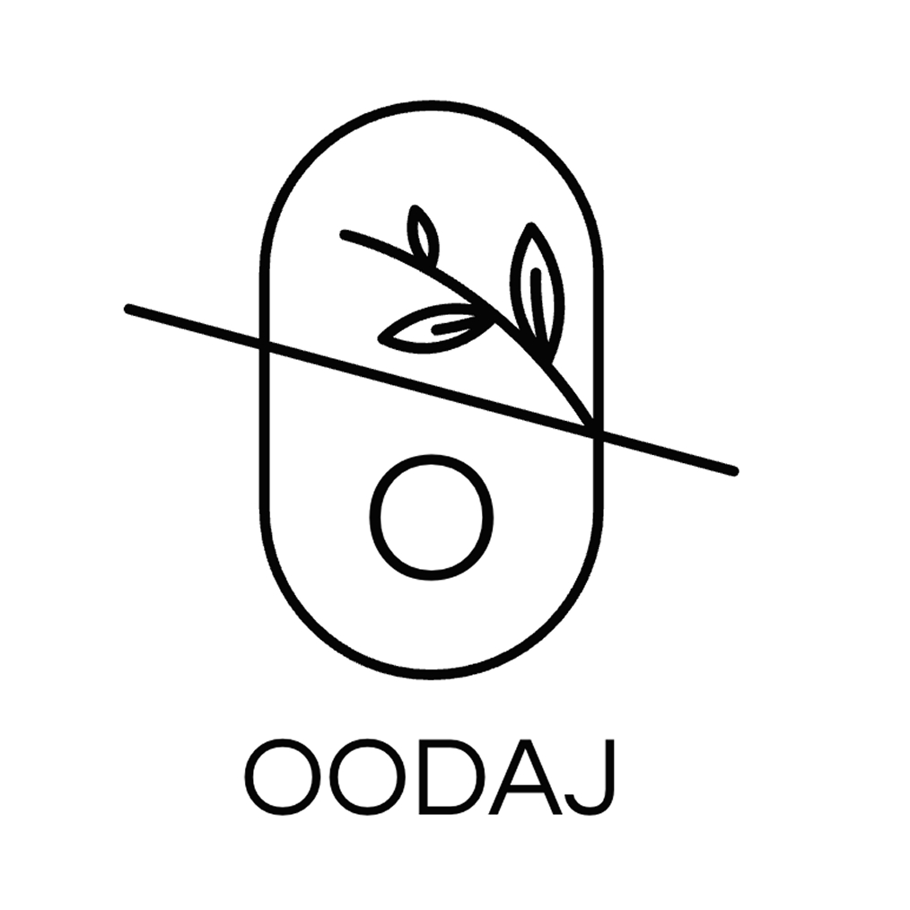
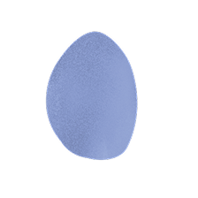
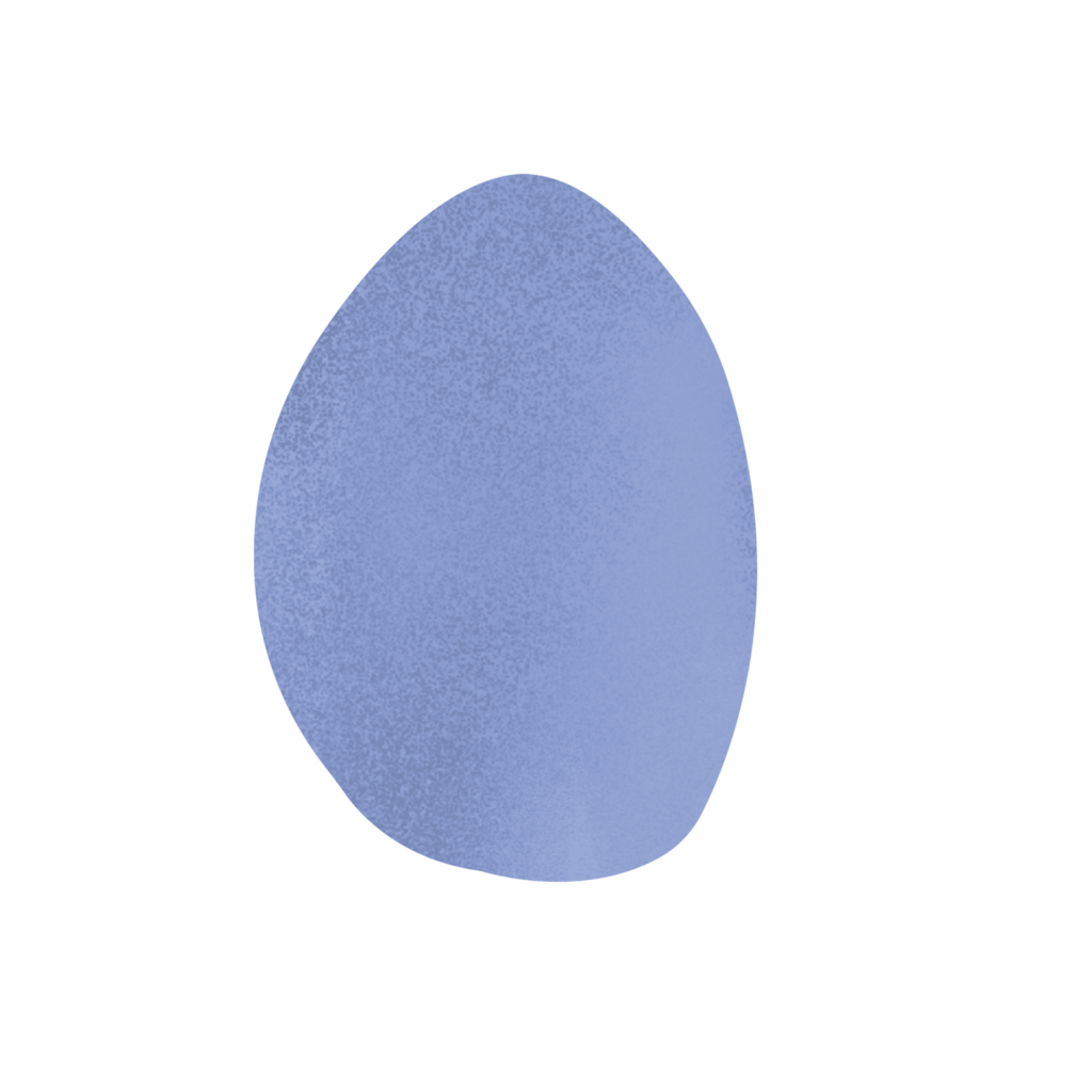
The Oodaj logo is inspired by the purity of natural forms.

Its organic silhouette evokes the curve of a polished stone and the movement of the hand that shapes it.

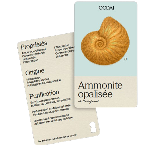
The typography is stable and precise, expressing trust, clarity and scientific accuracy.

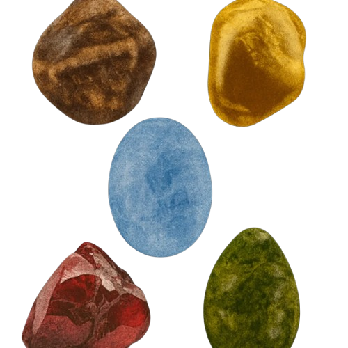
The chromatic palette is taken directly from the mineral world: ochre, amber, jade green, sky blue and clay brown.

Soft, luminous tones that perfectly support a pedagogical and sensorial universe.

A platform that highlights the uniqueness of every stone

We designed an e commerce experience capable of presenting each stone as an encyclopedic micro story.

Composition, benefits, origin, usage, real photography: each product page becomes a clear and reliable narrative.

A design that simplifies exploration and supports learning.

Raw and distinctive
illustrations

Hand drawn shapes reflect the diversity of the mineral world.

They add texture, rhythm and warmth to the interface without distracting from the content.

A simple and expressive graphic language that immediately identifies the brand.

A coherent and vibrant print and social media system

From e commerce to social media, the brand expresses itself through a unified visual language.

Print and digital assets ensure visual continuity across packaging, labels, guides and educational content.

A global system dedicated to simplicity and transmission.

A harmonized expression across all formats

Oodaj speaks to a community that values beauty as much as truth.

Every visual, every typeface and every interaction reinforces this intimate relationship between knowledge and emotion.

A brand that inspires trust, curiosity and connection.

© Agency: Yourst

© Creative direction : Fiona Grimaud & Blandine Jaillais

The final word.

“Working with Yourst has been a true revelation. The team immediately understood the sensitivity of the brand and the way I wanted to express the beauty of minerals. Thanks to their vision, Oodaj now has a clear, educational and deeply authentic identity that reflects my values.”

Jade
Founder of oodaj